
Mind the Gap: Empty States Design and the (often missed) Opportunity to Reconnect with the User
Imagine the following scenario: you arrive at a hotel where you’ve booked yourself a room, walk up to the reception and receive a key with brief instructions on how to locate your room on the third floor; you take the elevator up and get off on your floor, and start to follow the signs along an endless, poorly illuminated corridor; there it is, you think to yourself as you reach the end of the corridor, your room! Only it isn’t, in fact, you have found the storage room, filled with bottles of detergents and stacks of neatly folded white towels and toilet paper.
Frustrating, wouldn’t you say? This is of course not an unfamiliar experience for many users who have navigated through a complex information system or online platform:
broken links, dead ends, error messages… empty states.
So let’s dive into the fascinating world of empty states and visual communication with users in their successes, as well as in their most agitated and fragile moments, for example, when they are confronted with a system failure or limit.
Empty State – Taking the Time to Reconnect with the User
Finding the right tone (e.g., positive reinforcement, encouragement, comfort) and aesthetic are key to improving user experience. Even an error is, in this sense, not just an error but also a perfect opportunity to reconnect with the user on a more personal level.
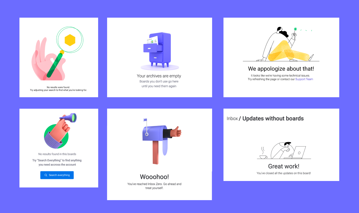
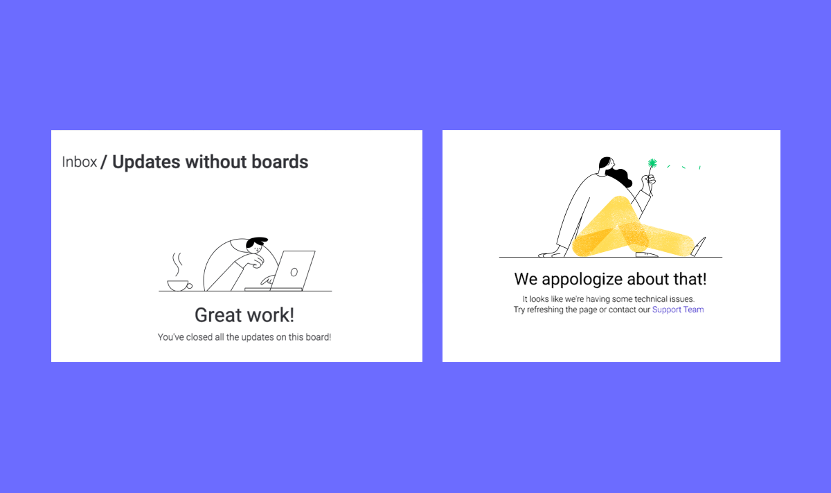
In the process of crafting the design of empty state messages for the monday.com platform, we tried out several illustration styles before we were able to lock-in on a consistent & effective aesthetic.
Trial and error: in this case, it meant considering certain technical aspects and limitations such as:
Size
The images had to be easily legible to the user on a small scale, with no more than 400-500 pixels, which meant simpler designs and avoiding detail overload.
Clarity
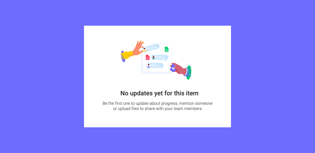
The graphics are not simply there for amusement but are intended to convey important information in the clearest way possible. Whether a temporary placeholder for future content or an error message due to current maintenance work or some other impasse – it’s important to give the user a sense of what’s going on.
The problem with this linear illustration style was relative illegibility on a small scale. The user had to make an effort to read and decipher the message. Also: this style is incompatible with dark-mode.
Color Scheme
We wanted the colors of the illustrations to be consistent all across the board. Previously (as you can see in the example below), empty states were inconsistent in terms of color. Moreover, as the brand was undergoing a certain color shift at the time, the empty-state images which were already in use became outdated.
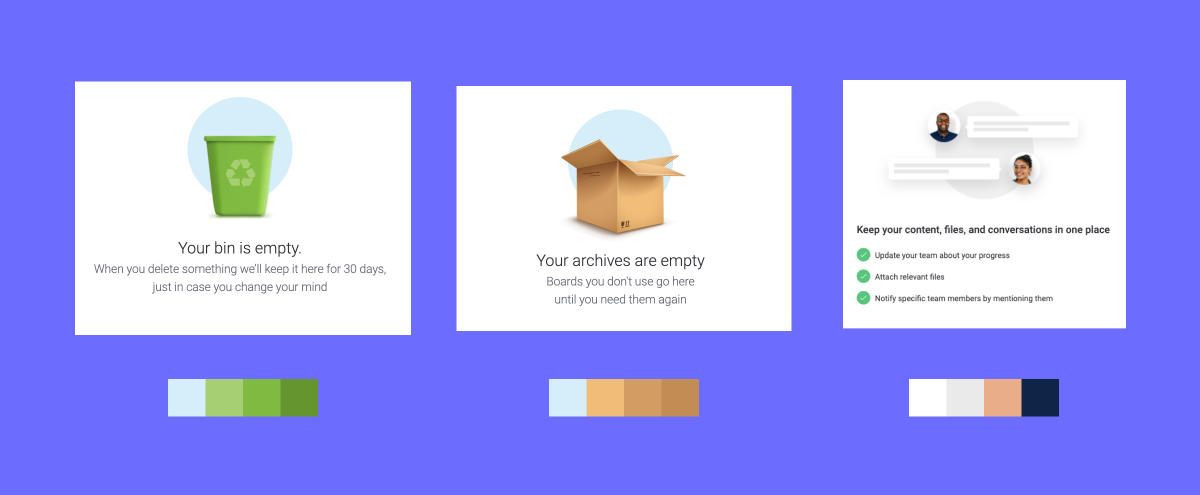
Examples: Older empty state images: inconsistent color scheme needed updating according to the new color scheme of the brand.
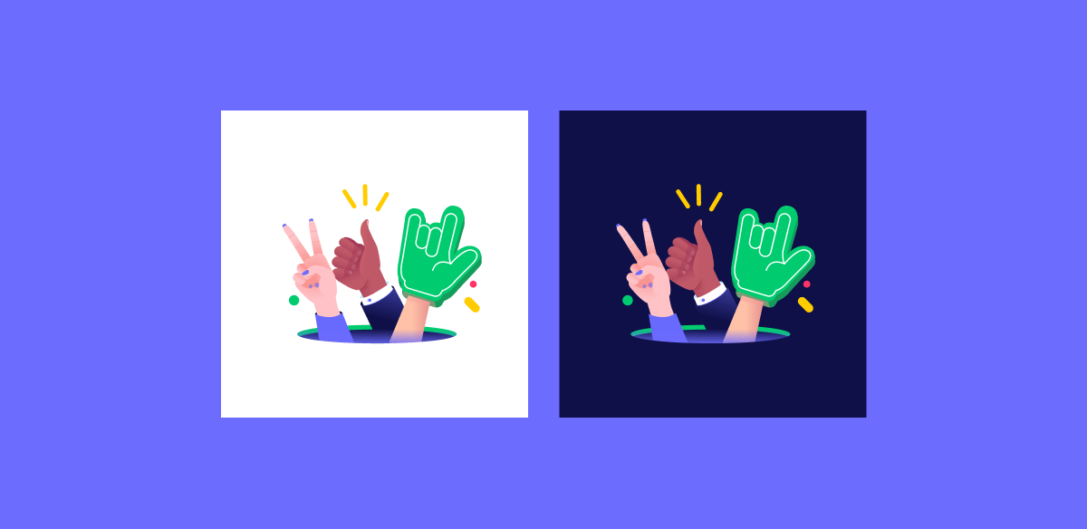
Examples: Current empty state images.
Dark-mode compatibility
Like many digital products in the market, monday also supports dark-mode display, which requires adapting the illustrations to a darker background. One possibility would have been to develop a separate set of empty state images that’s compatible with dark-mode display, but that would have entailed additional creative work for me and the illustration team, as well as extra labor for the developers who then had to embed them in the system. Therefore, I decided to tweak the colors of the illustrations until I arrive at the point where the same illustration was equally legible and clear to the user both in normal and dark mode settings.
Animation
With help from our extremely talented motion designers, Ori Greenberg & Inbal Gery, we added animation to many of the illustrations for the purposes of conveying more nuanced information and adding entertainment value.
While working together, we realized that, for better or for worse, animation attracts a great deal of attention. This can be useful, on one hand, as it helps communicate information more efficiently than a single static image, and helps focus the user on what’s important. On the other hand, too much movement & action might make the viewer feel disoriented and confused, so we tried to avoid it in sensitive or more complex states.
We were also concerned that looping animation might mislead users into thinking they were actually watching an animated loader (and therefore expect something to happen at the end of the process), which of course was not the case. To avoid confusion and potential frustration, we decided to create short, single-play, animations that stop and become static after one loop. By hovering with the cursor over the illustration, the user can “trigger” the animation into action for another round, then the image returns to static, and so on.
Sidenote: Video formats are quite large, and naturally they take more time and resources to load. It was crucial to us that the animation we develop would not affect screen loading time. Therefore, we chose to work with Lottie, an animation tool that converts animation into much lighter and responsive JSON code. This also allowed us to program the image retriggering mechanism simply by hovering the cursor over the illustration.

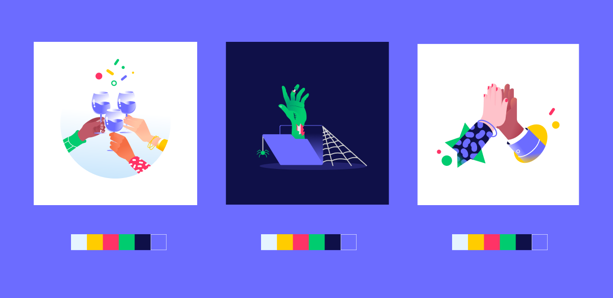
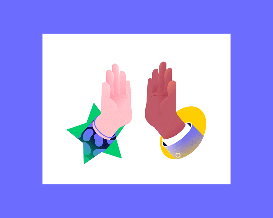
Why the hands?
Besides the fact that hand gestures are a universally common element of communication (with some variations between cultures) and highly intuitive as such, it is also, at least metaphorically, the physical medium with which we “reach out and touch” one another, particularly in a time of need.
Unlike physical objects you can touch and feel, the product that we design at monday.com is intangible, and existing only “in the cloud”. Using illustrations of hands touching and feeling different elements from the system was our way of introducing a tactile dimension into the user’s experience; to give the users the feeling that they can touch our product.
Returning to the hotel example with which we started: imagine yourself now opening that door to the hotel storage room, which you hoped was your room. Instead of an avalanche of broomsticks and toilet paper rolls, a kind staff member greets you with a warm friendly smile, offers you a little treat, and escorts you to your room. Much better, right? A little humor and little empathy in the fragile moment of encountering an empty state – call me a romantic, but I prefer calling them empathy states, instead!
This project couldn’t be done without our amazing team, thank you:
Evgeniy Kazenic
Shay Cohen
Ori Greenberg
Inbal Gery
Miri Kuntsman


